本篇记录的是使用CSS3绘制3D立方体,并旋转起来。
我的思路:
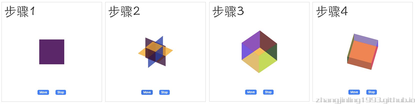
1️⃣ 首先,用div元素画6个正方形摞在一起放在画布中间。为了区分,分别给每个div选择了不同的颜色,并且设置为半透明方便透视。
2️⃣ 将6个div元素分为三组(上下一组、左右一组、前后一组),想象以画布中心为圆点,使三组分别沿x/y/z轴旋转90度。
3️⃣ 上下一组,一张向上推50%正方形边长,一张向下推50%正方形边长;左右同理向左右推50%边长,前后同理向前后推50%边长。
4️⃣ 整体旋转展示。
查看效果:Demo效果
※ Html代码&CSS样式布局:1
2
3
4
5
6
7
8
9
10
11
12
13
14
15
16
17
18
19
20
21
22
23
24
25
26
27
28
29
30
31
32
33
34
35
36
37
38
39
40
41
42
43
44
45
46
47
48
49
50
51
52
53
54
55
56
57
58
59
60
61
62
63
64
65
66
67
68
69
70<!DOCTYPE html>
<html lang="en">
<head>
<meta charset="UTF-8">
<title></title>
<style>
.container {
width: 400px;
height: 400px;
border: 1px solid #cccccc;
}
.box {
position: relative;
width: 100px;
height: 100px;
margin: auto;
margin-top: 150px;
transform-style: preserve-3d;
}
.box div {
position: absolute;
top: 0;
left: 0;
width: 100%;
height: 100%;
opacity: .5;
transform-origin: center;
}
.box div:nth-of-type(1) {
background-color: red;
}
.box div:nth-of-type(2) {
background-color: yellow;
}
.box div:nth-of-type(3) {
background-color: green;
}
.box div:nth-of-type(4) {
background-color: blue;
}
.box div:nth-of-type(5) {
background-color: black;
}
.box div:nth-of-type(6) {
background-color: darkmagenta;
}
</style>
</head>
<body>
<div class="container">
<div class="box animate">
<div></div>
<div></div>
<div></div>
<div></div>
<div></div>
<div></div>
</div>
</div>
</body>
</html>
※ CSS3添加6个正方形的动画效果1
2
3
4
5
6
7
8
9
10
11
12
13
14
15
16
17
18
19
20
21
22
23
24
25
26
27
28
29
30
31
32
33
34
35
36
37
38
39
40
41
42
43
44
45
46
47
48
49
50
51
52
53
54
55
56
57
58
59
60
61
62
63
64
65
66
67
68
69
70
71
72
73
74
75
76
77
78
79
80
81
82
83
84
85
86
87
88
89
90
91
92
93
94
95
96
97
98
99
100
101
102
103
104
105
106
107
108
109
110
111
112
113
114
115
116
117.box.animate div {
animation: ease 4s 0s infinite;
}
.box.animate div:nth-of-type(1) {
animation-name: box1-move;
}
.box.animate div:nth-of-type(2) {
animation-name: box2-move;
}
.box.animate div:nth-of-type(3) {
animation-name: box3-move;
}
.box.animate div:nth-of-type(4) {
animation-name: box4-move;
}
.box.animate div:nth-of-type(5) {
animation-name: box5-move;
}
.box.animate div:nth-of-type(6) {
animation-name: box6-move;
}
@keyframes box1-move {
0% {
transform: rotatex(0deg);
}
25% {
transform: rotatex(90deg);
}
50% {
transform: rotatex(90deg) translatez(50px);
}
100% {
transform: rotatex(90deg) translatez(50px);
}
}
@keyframes box2-move {
0% {
transform: rotatex(0deg);
}
25% {
transform: rotatex(90deg);
}
50% {
transform: rotatex(90deg) translatez(-50px);
}
100% {
transform: rotatex(90deg) translatez(-50px);
}
}
@keyframes box3-move {
0% {
transform: rotatex(0deg);
}
25% {
transform: rotatey(90deg);
}
50% {
transform: rotatey(90deg) translatez(50px);
}
100% {
transform: rotatey(90deg) translatez(50px);
}
}
@keyframes box4-move {
0% {
transform: rotatex(0deg);
}
25% {
transform: rotatey(90deg);
}
50% {
transform: rotatey(90deg) translatez(-50px);
}
100% {
transform: rotatey(90deg) translatez(-50px);
}
}
@keyframes box5-move {
0% {
}
25% {
transform: translatez(0px);
}
50% {
transform: translatez(50px);
}
100% {
transform: translatez(50px);
}
}
@keyframes box6-move {
0% {
}
25% {
transform: translatez(0px);
}
50% {
transform: translatez(-50px);
}
100% {
transform: translatez(-50px);
}
}
※ 添加整提旋转动画1
2
3
4
5
6
7
8
9
10
11
12
13
14
15.box.animate {
animation: box-move ease 4s 0s infinite;
}
@keyframes box-move {
0% {
transform: rotatex(0deg) rotatey(0deg)
}
50% {
transform: rotatex(45deg) rotatey(45deg)
}
100% {
transform: rotatex(405deg) rotatey(405deg)
}
}
动画转的我有点头晕🤦♀️,所以我决定把.animate类名剥离出来,用JavaScript通过按钮触发的模式将.animate添加到DOM中去,这样,只有点击按钮后动画才会被触发。最后,我添加了两个按钮,move和stop,分别用来触发动画和使动画停止。1
2
3
4
5
6
7
8
9
10
11
12
13
14
15
16
17
18
19
20
21
22
23
24
25
26
27
28
29
30
31
32
33
34
35
36
37
38
39
40
41
42
43<!-- Html代码 -->
<div class="ope">
<button id="animate">Move</button>
<button id="stop">Stop</button>
</div>
<!-- CSS代码 -->
.ope {
margin-top: 100px;
text-align: center;
}
.ope button {
margin: 0 10px;
border: 1px solid #4380f5;
border-radius: 5px;
cursor: pointer;
background-color: #4380f5;
color: #ffffff;
outline: none;
}
.ope button:hover {
background-color: #3e76e3;
}
.ope button:active {
background-color: #3361ba;
}
<!-- JavaScript代码 -->
<script>
(function () {
var box = document.getElementsByClassName('box')[0];
document.getElementById('animate').onclick = function () {
box.className = 'box animate';
}
document.getElementById('stop').onclick = function () {
box.className = 'box';
}
})();
</script>